Picasso and his circle

The problem with a prodigious talent like Pablo Picasso is: how or where do you begin to make any sort of meaningful assessment of his work? He lived to a ripe old age; he was extremely prolific across multiple media; he befriended so many artists and writers; and he had numerous wives and mistresses, his personal life is a rich subject all on its own. Every few years, a new insight comes into focus, via major retrospectives or academic studies. The closest we have to an official biography extends to 4 volumes, and has so far only reached 1943 (Picasso died in 1973). Then there are the record-breaking art auctions

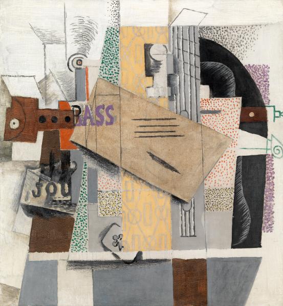
Pablo Picasso: “The violin (Le violin)” (1914) by Pablo Picasso © Succession Picasso/Copyright Agency, 2022; Photo: © Centre Pompidou, MNAM-CCI/Georges Meguerditchian/Dist. RNM-GP; Image sourced from NGV

So it must be with some trepidation that visitors approach the latest example of “making sense of” Picasso – the NGV’s current blockbuster exhibition, ominously titled “The Picasso Century”. The sheer volume of his output, the breadth of techniques and the range of styles can be overwhelming. This major exhibition (drawing mainly on the collections held in the Centre Pompidou and at the Picasso Museum, Paris) is arranged fairly conventionally, in chronological order, and reflecting the major periods of Picasso’s work.

There are glimpses of the post-impressionist Blue Period, the flirtation with Primitivism and Fauvism (which sparked a life-long rivalry with Matisse), and his dominance of Cubism (although both Braque and Gris gave him a run for his money). Plus the importance of people like Gertrude Stein who, initially through her brother, became an early admirer, friend and collector.

Then there is his association with the Surrealists, although I’ve never felt he fully embodied their movement. Sure, he was instrumental in furthering their aims, he counted many of its practitioners as close friends and associates, and he participated in many of their exhibitions, manifestos, happenings and publications. But Picasso did not really pursue the juxtaposition and sub-conscious of major Surrealists such as Dali, Magritte or Ernst. That’s not to say Picasso didn’t reveal his sense of humour or his liking for fantasy – but unlike some of his peers, he was always in control, nothing was left to chance, and even his re-telling of ancient myths and legends was self-serving and relatively orthodox.

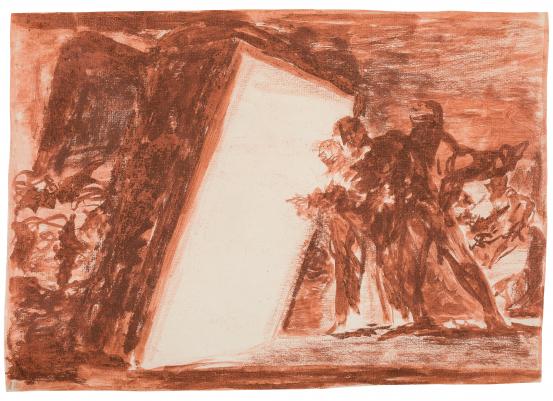
First and foremost, Picasso was an excellent draftsman, and his lines and mark-making were always deliberate, distinctive and revealing – as seen in some of the archive footage of Picasso at work in his studio. (I think the dismissive argument that “any 3 year old could have drawn that” has long been debunked.)

Of course, when there are so many works to choose from, the curators are spoiled for choice, and narrowing down this selection must have been challenging – even though they stick gamely to their particular narrative(s), resulting in a balanced and consistent presentation. There are a couple of insights which I did find refreshing – Picasso’s association with Wilfredo Lam, and his dabbling in political themes (mainly stemming from his membership of the Communist Party in France). The one weakness in this exhibition is the extensive display of ceramic plates from Picasso’s later years. I’ve never been a fan of these pieces, as I don’t think they add much to his body of work. There is a sense that he would make these almost on demand, and had them at hand for when visitors and souvenir hunters tracked him down to his studio.

Nonetheless, this exhibition is highly recommended, and provides yet another excuse to admire the work of Picasso’s peak artistic years, from 1909 to 1949. Prior to that period, he was still finding his artistic voice (and creating his own myth); and after that, he found himself having to live up to (and even exaggerating) the myth he had built up for and around himself. Whatever else this exhibition may reveal about his life, the work is still what counts.

Next week: An AI Origin Story

Goya – allegories and reportage for the modern age

Just prior to the latest COVID-related lock down in Melbourne, I managed to visit the exhibition of drawings and prints by Goya at the NGV. Although these works were produced 200 years ago, they are still relevant today.

Goya: Two People Looking into a Luminous Room – Image sourced from NGV

Working at the time of the Enlightenment, and despite his status and reputation as a court painter, Goya still had to navigate the political oppression of both Spanish and French rulers, and the religious persecution in the form of the Inquisition.

His series of drawings and etchings reveal a very personal side to Goya’s work, combining allegory, satire, reportage, surrealism and the sub-conscience. The images provide a commentary on the horrors of war and its aftermath, while his domestic scenes on courtship, gold diggers and hapless suitors would not be out of place on Married at First Sight or The Bachelor… There’s a lot that’s familiar about these images.

The exhibition provide some insights into Goya’s working methods – from his use and development of preparatory drawings, to the different etching techniques he deployed to create the finished prints.

One drawing in particular caught my attention – a red crayon sketch entitled “Two People Looking into a Luminous Room”. It’s a remarkable image on a number of levels. The room of the title does not look like a typical building or structure. It almost resembles the bellows of a giant camera, except that photography had not yet been invented. Perhaps it refers to a type of camera obscura or similar device that Goya had seen? On the other hand, it could be a metaphor for Hell, a glimpse into the white heat of the Inferno. For me, it even suggests Goya’s prescience for the work of James Turrell. It’s a remarkable piece in an absorbing exhibition.

Next week: The Fall – always different, always the same

NGV Triennial

As Melbourne and Victoria continue to emerge from lock-down, it was great to see that the NGV International has re-opened for the summer with the latest edition of its Triennial show. And while we should all be grateful to have the opportunity to visit this exhibition in person (rather than on-line), it’s not without some shortcomings.

Refik Anadol: Quantum Memories (image sourced from NGV website)

First, the good news: no doubt it was a logistical headache to co-ordinate this exhibition while Melbourne was in strict lock-down for much of the past 10 months. Making admission free is also a wonderful public gesture given that the local population was starved of art exhibitions for most of last year – in particular, we missed out on the NGV’s winter blockbuster season.

The curators are also to be commended on assembling a diversity of artists, work and media; and for placing a great number of these new pieces among the NGV’s permanent collections, which forces visitors to assess these contemporary exhibits within the context of historic work.

But that’s probably where the positive ends.

A major drawback of this exhibition is the lack of anything truly ground-breaking, innovative or even challenging. It all felt very safe – but maybe that’s just what we needed after our extended social isolation: work that is comforting, familiar, cozy, cuddly, soothing, and certainly bright (lots of lively colours).

As a result, however, there seemed to be an emphasis of form over substance, technique over content, and scale over context. Much of the three-dimensional work felt flat and one-dimensional. Even the opening centrepiece, Refik Anadol’s “Quantum Memories” that dominates the entrance lobby, is a classic example of the “medium is the message”. Comprising a giant digital screen (incorporating a clever trompe-l’œil 3-D effect) to stream animated, computer-programmed images, ultimately gave the impression that this was all about the technology and the scale of the work. It was difficult to identify any meaning beyond mere decoration.

And unfortunately, “decorative” was a recurring theme, alongside some rather kitsch and lazy imagery – especially the digital and animated wallpaper that featured in several of the permanent galleries. These “displays” reminded me of cheesy son et lumière or pedestrian CGI effects – it may be technically adept, and even stylish to some degree, but that’s as far as it goes. Perhaps “deep” and “complex” are out of favour at the moment, as we make way for “shallow” and “simple”.

While some work might attempt to convey a more profound response, when shorn of its original context, the message is lost and the result is a void. I wasn’t necessarily looking for “deep and meaningful”, but I was hoping to be provoked or inspired. Or at least have my curiosity piqued.

Triennial? Could try harder.

Next week: Expats vs Ingrates?