Haring vs Basquiat

Following last week’s “compare & contrast” entry, another similar exercise this week, between artists Keith Haring and Jean-Michel Basquiat, the subject of the NGV’s summer blockbuster exhibition.
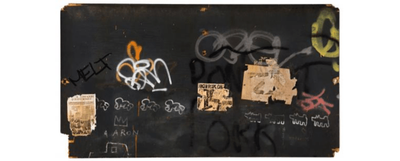
Keith Haring, Jean-Michel Basquiat, Other artists: “Untitled (Symphony No. 1)” c. 1980-83 [image sourced from NGV website]

Given their friendship, collaborations and mutual connections to the New York scene of the 1980s, it was only natural that the NGV went for this double-header retrospective. Since they both gained early recognition for their street art and graffiti-based work, and their images crossed over into the worlds of music, fashion and clubbing, they had a lot in common. They were as likely to be featured in style magazines such as The Face as they were to be found in the arts section (or society pages) of the New York Times.

Both died relatively young, and it’s as if they somehow knew they each had limited time, such is the intense pace at which they worked, as evidenced by their prolific output. If there is one element that really links them is their inner drive – they had to produce art, there was no choice for them, and they threw everything into it.

They each developed their own distinctive visual styles, much imitated and appropriated throughout popular culture, graphic design, video and advertising. Haring is known for his dog motif and cartoon-like figures, Basquiat for his iconic crown and text-based work. They also placed great emphasis on issues of identity, gender, sexuality and broader sociopolitical themes.

Where they perhaps differ is that Haring relied on more simplistic imagery (albeit loaded with meaning and context), using mainly primary colours, flat perspective (no shading or depth), and strong repetition. On the other hand, Basquiat’s paintings reveal confident mark-making, bold colour choices (not always successful), and an implied love of semiotics (even more so than Haring’s almost ubiquitous iconography).

Of course, we’ll never know how their respective work would have developed over the past 30 years – maybe what we now see is all there was ever going to be? As a consequence, there is perhaps a sense that they plowed a relatively narrow field, that they did not develop artistically once they became gallery artists. I’m not suggesting their work is shallow or one-dimensional (even though it can simply be viewed and appreciated “on the surface”), but it would have been interesting to see where their work took them.

Finally, we are still very close to the era in which they were active, and in that regard their true legacy will be in the influence they cast on late 20th century art and beyond.

Next week: Hicks vs Papapetrou


Craft vs Creativity

In a recent blog on Auckland, I mentioned seeing some Maori artifacts or Taonga during a gallery tour. The curator had mentioned that these objects raise questions of whether they are art, or craft. Does the distinction matter? Not necessarily, but I think it’s important to understand the difference between craft (largely skills-based) and art (largely aesthetically-driven). Often these concepts overlap, and are sometimes misconstrued, which in turn influences how we attach value, appreciation, importance and significance to particular objects.

Anton Gerner, A Cabinet With No Front Or Back 2019, Fiddleback Blackwood, Celery Top Pine. (Image sourced from Craft Victoria)

What often gets viewed as “pure” art is more a result of design, technique and skill – attributes which are more usually associated with craft (or “applied” art). Indeed, it is noticeable how viewers seem to appreciate “effort” over “creativity”. A great number of exhibitions I see in contemporary art galleries are more about illustration, decoration and process – and it’s as if the time taken to create the work or the complexity of the object is more important than the actual aesthetic outcome.

On the other hand, a lot of work that is assigned to the category of “craft” is capable of sitting alongside sculptures and 3-D work in an art gallery. Equally, a lot of work (especially in the fields of ceramics, textiles and jewellery) has neither the aesthetic form to be considered as art, nor the functional form to be regarded as craft.

For me, craft involves considered decisions about the choice of material, the design and production process, plus the intended function (even if the latter is only for decorative purposes). Whereas art is usually undertaken for the purpose of arriving at an intended creative outcome, with the choice of materials etc., often being secondary to the final aesthetic result.

Both art and craft can be seen in cultural, social and even political terms. They are also informed by context and narrative. But successful art should convey more creativity than applied craft or technique. And craft is often diminished if it fails to conveys some practical element of function – what’s the point of a beautiful jug if it cannot pour water?

Two recent exhibitions underline how the distinction between “art” and “craft” is often blurred: the Victorian Craft Awards, and MasterMakers at RMIT Gallery. In the Craft Victoria display, most of the pieces had no real practical purpose (other than decoration); yet, in terms of achieving an aesthetic goal, it felt like this was subservient to the materials and the process. While in the RMIT exhibition, there was an emphasis on the materials, plus an acknowledgement that even very technical processes can also result in objects that offer aesthetic pleasure – where form and function truly combine, and are inherently equal in the work. (The Anton Gerner furniture at Craft Victoria also manages to achieve that combination.)

We still don’t really know why the first cave paintings were made – were they an early form of graffiti? do they tell a story or capture events for posterity? were they the result of experimenting with pigments or dyeing techniques? or were they the result of some existential desire to give rise to a form of human expression? or simply to have something nice to look at? But we know we can appreciate them for their aesthetic level as well as their technique – in addition to their historical significance.

Next week: Notes from Phuket


Notes from Auckland

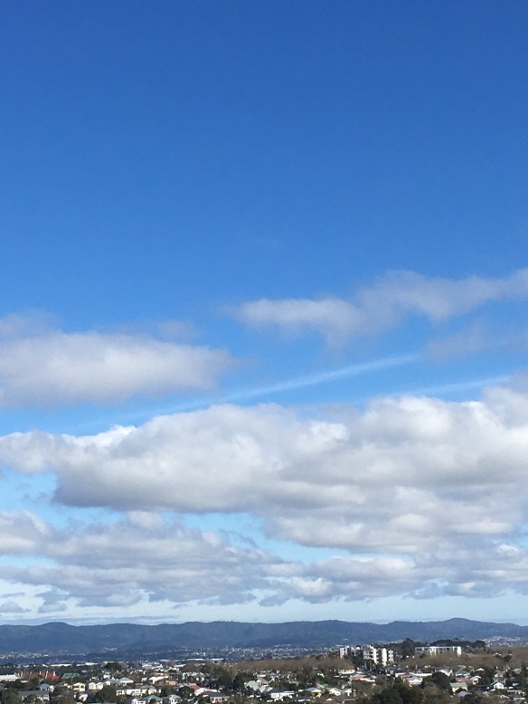
Over the past couple of years, I’ve been fortunate to make several trips to Auckland, as part of the work I do with Techemy and Brave New Coin. Although I had been to New Zealand a few times before these latest visits, it was only recently that I understood why Maori call it Aotearoa – “Land of the Long White Cloud” – as you can see from this photo I took from the office window.

To anyone from Australia who has spent time in New Zealand, it is quickly apparent that Maori culture and language are far more respected and recognised than idigenous identity is across the Tasman. From the bilingual signage and national anthem to the Haka performed prior to every All Blacks game, Maori identity is more visible and celebrated.

On my most recent visit a couple of weeks ago, this was reinforced during a guided tour of the University of Auckland’s art collection, as part of Artweek. First, the guide used Maori words for local place names. Second, he drew attention to some of the challenges that he and the other curators face when dealing with Taonga objects – which also opens up the debate about art vs craft. Third, he acknowledged that in his own early studies, he was influenced and even encouraged by his tutors to incorporate elements of Moari art into his own work – even though as someone of European (Pakeha) descent he did not really understand what these images represented. Finally, this form of appropriation can lead to questions about whether an artist’s identity (cultural or otherwise) should define their work and whether that work should only be interpreted through their identity. For example, can “maori art” only be produced by artists who are ethnically Moari? The artist Gordon Walters deployed images of Koru in his most famous work, which can divide critics and academics.

In many ways, Auckland is very similar to Sydney – both are their country’s largest city, but neither is the capital. Both are formed and defined by their respective harbours – and this in turn very much influences how people engage with their city: based on where they live, and their commute to work. Likewise, both Auckland (Albert Street) and Sydney (George Street) are trying to play catch-up with their public transport systems, which have not kept pace with the rate of urban and population growth. And, no doubt connected, both cities have very expensive property markets.

One of the things that I always notice in Auckland is how many buildings in the CBD are polyhedron in shape. Some of them even display an element of “Pacific Brutalism” which seems to be very popular in public and municipal architecture, from Hawaii to Singapore and beyond. It could be that polyhedral structures are more earthquake prone – or because Auckland is very hilly, giving rise to “creative” building designs.

To overcome the topography (and the limitations of the public transport system), a number of hire companies offer electric scooters for getting around the city. While it seems a great (and environmentally friendly) idea, the fact that there are no fixed pick-up and drop-off points, users can leave them anywhere – and many are even to be found lying across the pavement, causing something of an obstruction.

Finally, no visit to Auckland is complete without a ferry ride to Waihiki Island, for lunch and/or wine-tasting at one of the many cellar doors.

Next week: Startup Vic’s Pitch Night for Migrant and First Generation Founders


Recent Notes from Europe

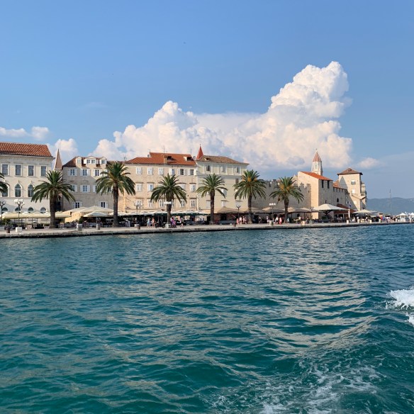
Over the past few weeks I have been travelling in Europe – Switzerland, Croatia and Italy. It was a great trip, and prompted a few observations along the way. Here are some key recollections.

First, after making a number of trips by train, bus and boat, it reinforced the sense that in Europe, public transport is seen as an essential service and not just a means of last resort (you know, that notion we sometimes experience elsewhere that suggests “only losers take the bus”). As a result, public transport is generally clean, safe, efficient, punctual and largely affordable. One counterpoint is that as a temporary visitor, accessing and paying for tickets such as multi-day / multi-system travel passes is not always straightforward.

Second, despite the close proximity of the three countries I visited, I had to use different fiat currencies in each location – and in the case of Croatia, although it is a member of the EU, the Euro is not always accepted and it maintains a separate currency (the Kuna) that is not easy to exchange outside the country. And when you get cash out of an ATM, it’s mostly in denominations of HRK200 – but local shops hate having to change large notes. Plus, there are still instances where plastic money is not accepted.

Third, visiting the extensive national art collections in Zurich (the Kunsthaus) and Milan (the Museo Del Novecento) was a great opportunity to see works by significant twentieth century artists beyond the Dadaists and Futurists respectively – including many works that rarely travel abroad.

Fourth, for all my reservations about organised religion, you can’t deny that a key legacy of European Christianity is church architecture, and the associated patronage of the arts. The Duomo in Milan even affords visitors the opportunity to walk along the roof terraces to get closer to the decorative flying buttresses and mini-spires topped with hundreds of statues.

Finally, along with all the excellent food I was lucky enough to order in restaurants, the trip was a great opportunity to sample local and regional wines, especially while in Switzerland and Croatia. We just don’t see that much of these in Australia, for obvious reasons. Plus, the global phenomenon of craft beer is still alive and well, all adding to the gastronomic experience.

Next week: Recent Notes from Hong Kong