Triennial? Could try harder!

The NGV 2023 Triennial is really perplexing. It promises a lot, but ends up delivering very little of substance. I came away with no lasting impression of any particular work, and given there are 100 “projects” on display, that’s a very low strike rate.

First, the positives: it’s free; it draws in the crowds (especially during Melbourne’s late summer heatwave); there are over 120 artists involved; they include local and international, established and emerging names; most forms of art practice are represented; there is a LOT to look at.

Now the negatives: the curation felt scatter-gun, with the lack of a clear narrative theme or contextual thread; BIG is interpreted as being GOOD; the juxtaposition of new works with the NGV permanent collection must have seemed like a good idea, but the joins are abrupt and the implied associations often make no sense at all; and despite the variety of media, it all felt very samey, and nothing cutting edge; in fact, it all felt rather safe.

Much of the work looked like it had come off a conveyor belt, or designed by a focus group. So it ended up feeling bland, anodyne, tokenistic, worthy, “shocking” for its own sake, and was like a production line of the “latest thing”.

Often, less is more. This felt bloated and over done.

A great shame, and a lost opportunity.

Next week: State of the Music Industry…


Hicks vs Papapetrou

Another compare and contrast this week, and like last week, based on a current NGV exhibition – this time, head-to-head retrospectives of two Australian photographers, Petrina Hicks and Polixeni Papapetrou.

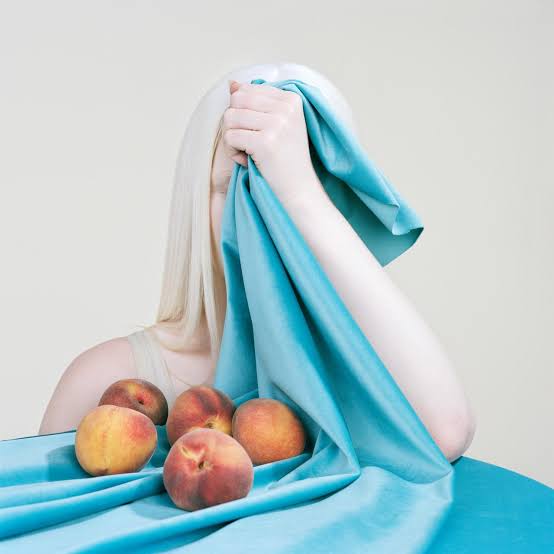
Petrina Hickson – “Peaches and velvet” (2018) – image sourced from NGV

The challenge for contemporary photographers is the ubiquity of the medium. Anyone with a smart phone can be a “photographer”. At a basic level, the technology to capture photographic images is accessible to all, and no special skill is required. Add to this the impact that advertising, magazines, fashion, portraiture, reportage and social media have had on the way we view images, and there is a risk that audiences detect no difference between what they see on a billboard poster, in an on-line news article, on Facebook/Tumblr/Instagram/Twitter or in an art gallery or museum.

In these two particular shows, I think the NGV is trying to re-establish a platform for contemporary photography as an art form, and not merely as a technical means of capturing and creating images. (Selfies, holiday snaps and wedding photos are all very well, but they ain’t necessarily art.) It’s an admirable ambition, but I’m not sure these collections are the best examples on which to build such a thesis.

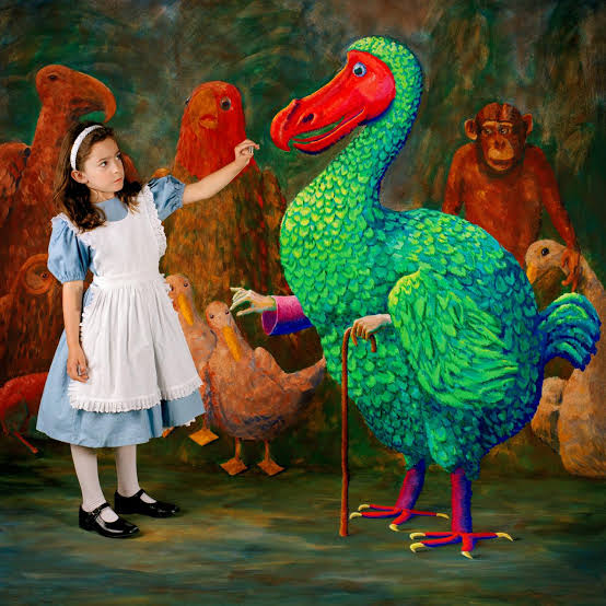
Polixeni Papapetrou – “Prize Thimble” (2004) – image sourced from NGV

Both photographers produce highly stylized, almost trademark images, which reveal a very methodical and deliberate approach to their work. Everything is highly choreographed, deliberately posed and meticulously arranged – nothing is left to chance, giving an overwhelming sense of artifice. These photographs are hyperreal yet also quite literal – what you see is what you get. This is not to say they lack formal narrative or even additional meaning, but despite their obvious visual appeal, it’s hard to see much beyond the images themselves.

In Hicks’ case, as well as recurring images, arrangements and visual motifs, the works on display reveal a very defined (even limited) colour palette, especially as many tones appear washed out, almost over-exposed. While Papapetrou’s work mostly feature her own daughter, in various staged settings, some of which allude to well-known fictional stories,  historical events, myths, legends and fairy tales. Despite both these exhibitions being retrospectives, based on these selections you would be hard-pressed to say there was much in the way of artistic development – there’s a sameness to both sets of images.

Despite each photographer having a distinctive style, there are also echoes of many other photographers – notably Julia Margaret Cameron, Madame Yevonde, Claude Cahun, Meret Oppenheim, Cyndi Sherman and Polly Borland among them.

Next week: The Current State of Popular Music


Haring vs Basquiat

Following last week’s “compare & contrast” entry, another similar exercise this week, between artists Keith Haring and Jean-Michel Basquiat, the subject of the NGV’s summer blockbuster exhibition.

Keith Haring, Jean-Michel Basquiat, Other artists: “Untitled (Symphony No. 1)” c. 1980-83 [image sourced from NGV website]

Given their friendship, collaborations and mutual connections to the New York scene of the 1980s, it was only natural that the NGV went for this double-header retrospective. Since they both gained early recognition for their street art and graffiti-based work, and their images crossed over into the worlds of music, fashion and clubbing, they had a lot in common. They were as likely to be featured in style magazines such as The Face as they were to be found in the arts section (or society pages) of the New York Times.

Both died relatively young, and it’s as if they somehow knew they each had limited time, such is the intense pace at which they worked, as evidenced by their prolific output. If there is one element that really links them is their inner drive – they had to produce art, there was no choice for them, and they threw everything into it.

They each developed their own distinctive visual styles, much imitated and appropriated throughout popular culture, graphic design, video and advertising. Haring is known for his dog motif and cartoon-like figures, Basquiat for his iconic crown and text-based work. They also placed great emphasis on issues of identity, gender, sexuality and broader sociopolitical themes.

Where they perhaps differ is that Haring relied on more simplistic imagery (albeit loaded with meaning and context), using mainly primary colours, flat perspective (no shading or depth), and strong repetition. On the other hand, Basquiat’s paintings reveal confident mark-making, bold colour choices (not always successful), and an implied love of semiotics (even more so than Haring’s almost ubiquitous iconography).

Of course, we’ll never know how their respective work would have developed over the past 30 years – maybe what we now see is all there was ever going to be? As a consequence, there is perhaps a sense that they plowed a relatively narrow field, that they did not develop artistically once they became gallery artists. I’m not suggesting their work is shallow or one-dimensional (even though it can simply be viewed and appreciated “on the surface”), but it would have been interesting to see where their work took them.

Finally, we are still very close to the era in which they were active, and in that regard their true legacy will be in the influence they cast on late 20th century art and beyond.

Next week: Hicks vs Papapetrou


MoMA comes to Melbourne

For its current “Winter Masterpieces”, Melbourne’s NGV International gallery is displaying around 200 works from MoMA’s permanent collection. And a finely selected, and well-curated exhibition it is. But this focus on the received canon of mainly 20th century European art has the inevitable effect of sidelining other eras/schools – and perhaps overlooks the importance of Australia’s own art movements.

Roy Lichtenstein (American 1923–97): “Drowning girl” (1963 – oil and synthetic polymer paint on canvas, 171.6 x 169.5 cm); The Museum of Modern Art, New York – Philip Johnson Fund (by exchange) and gift of Mr. and Mrs. Bagley Wright, 1971
© Estate of Roy Lichtenstein/Licensed by Copyright Agency, 2018

The NGV International display presents the work in a broad chronological sequence, but specifically collated by reference to key movements, themes and styles. It also takes in print-making, photography, industrial design, graphics and illustration, not just painting and sculpture.

Even though I have visited MoMA many times, and seen the bulk of these works in their usual setting (as well as when they have been on loan to other galleries), there were still some surprises – like Meret Oppenheim’s “Red Head, Blue Body”, which I don’t recall seeing before. And Salvador Dali’s “The Persistence of Memory” always feels like it is much smaller than the ubiquitous reproductions and posters imply.

Of course, one of the benefits of presenting a survey of modern art like this is that it affords us the opportunity to re-assess and re-calibrate the works within a contemporary context. Both to find new meaning, and to compensate for the over-familiarity that many of these images convey. While at times, we have to separate the artists’ lives and times from the legacy of their work – the changing conventions and social mores of our contemporary society cannot always be used to judge the behaviours, values or common prejudices that were acceptable 100, 50 or even 25 years ago.

Meanwhile, over at NGV Australia, there is a reconstruction of the exhibition that marked the opening of the gallery’s new building in 1968. In “The Field Revisited”, we have a fascinating opportunity to experience a slice of Australian art that feels over-looked and under-appreciated – ironic, given that at the time, this exhibition revealed the cutting-edge nature of young artists working in Australia, and divided opinion among established artists and the art establishment. “Where are the gum trees, where are the shearers, where are the landscapes, where are the figurative images?” might have been the refrain in response to this startling collection of bold colours, geometric designs, psychedelic undertones, modern materials, and unorthodox framing.

The fact that far more people are flocking to see the MoMA collection (and it is worth seeing), than are visiting the re-casting of The Field sadly confirms that Australia’s cultural cringe is alive and well….

Next week: Modern travel is not quite rubbish, but….