I’m old enough to remember when the filofax personal organiser (think PDA for hipsters?) became the must-have accessory in the yuppy culture boom of the early ’80s. (I recall my housemate, a creative at a leading ad agency, dashing around in panic one morning when he couldn’t find his filofax before he left for work – “That’s got my whole life in it!”.)
About the same time, home computers and desktop publishing software came on the market, and everyone became their own graphic designer.
One (thankfully short-lived) outcome when these trends collided was the emergence of the desktop designed resume, that could be printed out and stored in a filofax, including some that folded out to reveal the candidate’s illustrated profile. (I kid you not – I received several of these “cutting edge” CV’s when hiring for graduate-entry roles.)
More recently, there appears to be a fascination for infographic resumes – with a number of online tools available to turn your illustrious career into a poster with apparent ADHD – such as Pinterest, Kinzaa, Vizualize.me, and re.vu, among others.
I have no problem with using infographics to portray data and content in interesting and informative ways. But the problem with many of the resume designs I have seen is that they are either limited to portraying careers in a purely linear and/or statistical fashion; or they overcompensate by using “gimmicks” such as over-stylised graphics, irrelevant iconography and even multiple fonts. Much about these designs reveal a tendency for form over content.
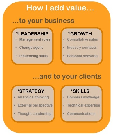
While it’s important to be able to tell a good story, what employers often want to know is: what can you do for them and their clients, now and in the future?

When you look like a refugee from the bottom of too many rucks as I do, infographics are way, way better than a photo.